Who Is Visiting The GeoNet Web Site And What Are They Looking At
Welcome, haere mai to another GeoNet Data Blog. Today’s blog is about visitors to the GeoNet web site, especially which countries they come from and what material they are looking at.
If you aren’t reading this blog on our smartphone app, then you are probably reading it on our web site. We put a lot of effort into creating, maintaining, and securing content on the web site. How do we know the site is useful and the content is what you want to read? Basic data on what countries our web site users come from and what web pages they look at don’t answer all questions about web content and its value, but they do provide some interesting insights, and today we are digging into that.
The Data
Our communications team provided data on visitors to our web site in 2023. We focus on the top 10 countries visiting the website, and on the main pages that were visited. A bit of a clarification before we start, there are many more visits than visitors. This is simply because individual visitors will often look at several pages on the web site during a single visit.
Quake Information is Most Popular
Of all the pages visited in 2023, the page providing information on Recent Quakes was by far the most popular with almost 15 million visits. The next most popular was the website’s Home page with almost 4 million visits. Then came News and the Strong motion data map with about a million visits each. Rounding off the top group were Volcanic Activity Bulletins and Earthquake drums with about 300,000 visits each.
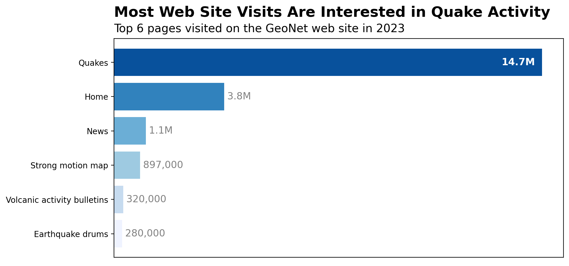
Web site pages visited. The length of a bar is proportional to the number of visitors to each page in 2023.
New Zealand Is Number One!
When we tell you that there were more web site visitors from New Zealand than any other country, we don’t think you’ll be surprised, but by how much New Zealand was ahead of the rest of the top 10 might surprise you.
In 2023, there were 3.6 million web site visitors from New Zealand. The next highest was our friends over the ditch with 126,000 visitors from Australia.
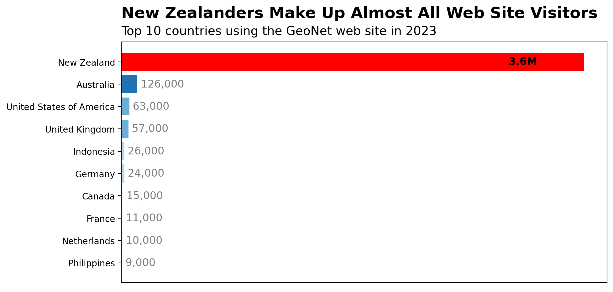
Web site visitors by country. The length of a bar is proportional to the number of visitors to the web site in 2023.
In terms of a country’s population, the number of visitors from New Zealand equates to 73 out of every 100 Kiwis visiting the web site once in 2023. For Australia, it’s equivalent to 1 out of every 200 Aussies, and for the other countries less than 1 out of every 1000 people.
Some Thoughts About What and Why
It is pretty clear that earthquake information is the biggest reason why people visited the GeoNet web site in 2023. Not only was the Recent Quakes page the most popular, but the Strong motion map and Earthquake drums pages also provide earthquake information.
We might have thought that the Home page would have been the most popular. The fact that it lagged so far behind Recent Quakes suggests that many who want information about recent quakes have been to that page before and saved it in their bookmarks, so next time they can go directly to the information they want.
However you look at it, most visits to the web site in 2023 were by someone looking for information, be it about a large earthquake or one they may have experienced, news material explaining something interesting in more detail, or information about volcanic activity. These pages all feature products that the GeoNet team has worked hard to create and make available to everyone, so its pleasing to see them attracting so many visits. Of course, there will have been those visiting the web site looking how to find data or other technical material we provide, but it seems that those were relatively small in number compared to those seeking basic information.
The countries with the top 10 visitor numbers fall into three regions: Asia-Pacific, North America, and Western Europe. Large parts of the globe seem not that interested in what we have to offer.
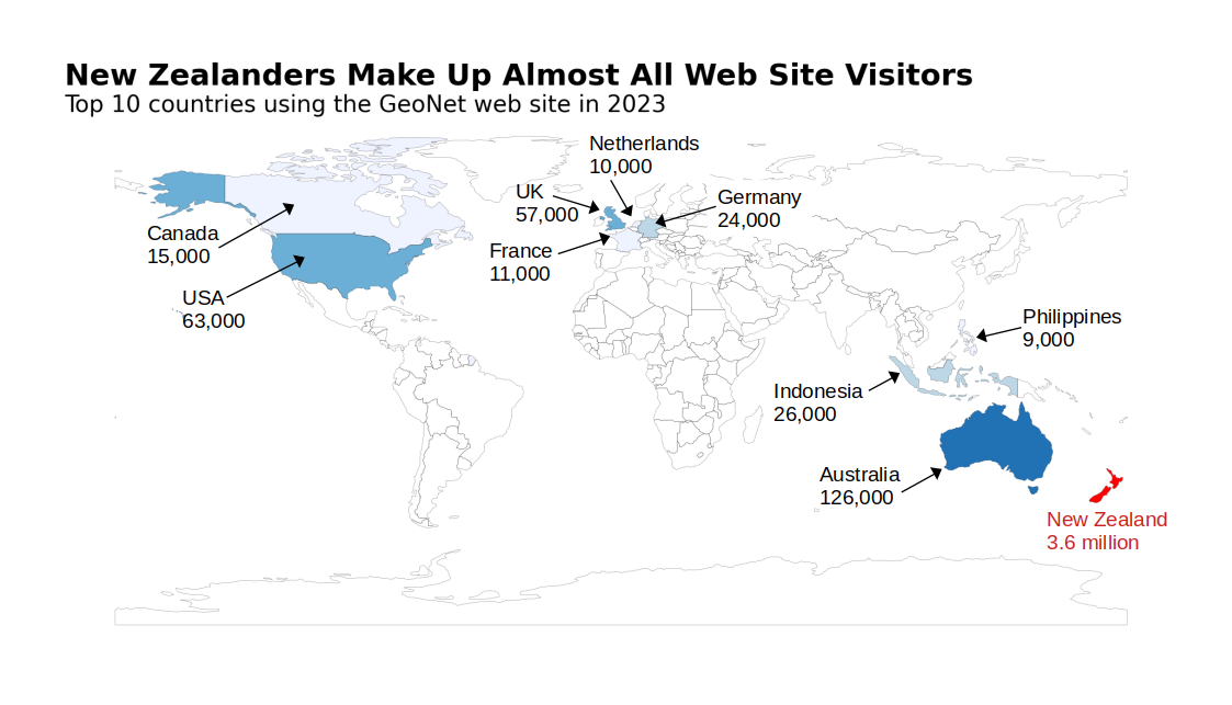
Web site visitors by country. The top 10 countries are in three groups: Asia-Pacific, North America, and Western Europe.
If we examine which web pages were looked at by visitors from different countries, we find that the overall top three pages: Recent Quakes, Home, and News were also the highest three for most of our top 10 countries. Information on earthquakes is interesting no matter where you live, even if you don’t experience them yourselves! The only country that bucked the trend is The Philippines, where a mixture of volcano pages and specific earthquake event pages were most popular.
The relatively high number of visitors from Australia and the UK might be explained by Kiwis living in both those countries checking up on things at home, especially if they heard about a big shake.
The busiest day in 2023 was February 15, with about 800,000 visits to our web site. That evening there was a magnitude 6.0 earthquake 50 km off the Kāpiti coast that was reported felt by 60,000 people, and 600,000 visits were made directly to Recent Quakes.
Choropleth Map
This is a short side note on the map. If you aren’t interested in how the map was made and some of the choices that were taken, you can skip to the end without missing anything important.
The map is called a choropleth map. These maps are often used where data values apply to a particular area. An example might be the proportion of votes received by a political party in each electorate at a General Election. Each electorate will be shaded according to the proportion of votes the party received. In our case, we colour each country according to the number of web site visitors. Of course, in this case, we only have the top 10 countries so most are left blank (white).
An important choice when making a choropleth map is what colours to use. Normally, a good recommendation is to use an application such as ColorBrewer to help select a set of consistent colours to use. In our case, we wanted New Zealand to stand out, so we used ColorBrewer to choose four blue hue colours and then added a bold red as a fifth colour.
How the shading colours relate to the data values is critically important to how a map looks and what conclusions your audience might draw. Because New Zealand has far more visitors than all other countries, setting the visitor-colour relationship isn’t straightforward. Many choropleth maps use a linear (or equal interval) mapping between values and colours, but this isn’t effective in our case as New Zealand is such a substantial outlier. Another common option is a logarithmic mapping between value and colour, where the colour changes unevenly with value, like 1000, 10 thousand, 100 thousand, 1 million, etc. This might have worked okay in our case, but a logarithmic scale can be confusing for people unfamiliar with it.
Instead, we chose to set our own value groups for the colour shades based on splitting the countries into five groups. Our groups are 20,000 visitors and below, 20,000 to 50,000 visitors, 50,000 to 100,000 visitors, 100,000 to 200,000 visitors, and more than 200,000 visitors.
Normally a choropleth map will have a colour bar to show the value to colour mapping. In our case, there are only 10 countries shaded and we wanted to directly label those on the map, so we omitted the colour bar. Directly labeling the countries and their values also mean that our choice of colour groups was less critical.
You might notice we used the same colours for the choropleth map and the country bar chart. It’s always a good idea to have consistent colours if you are trying to show one data set several ways.
That’s it for now
The data on what web pages were visited in 2023 highlights the importance of earthquake information in particular, but information products in general. Many of these products are a result of a lot of behind the scenes work that might be unknown to many visiting our website, but it’s clear this work is valuable. The countries that provided most visitors to our web site in 2023 is an interesting mix of the expected and perhaps the less expected. GeoNet is a New Zealand geohazard monitoring and advice agency so it’s not surprising that most web site visitors come from here, though the degree to which New Zealand visitors dominate is perhaps unexpected.
You can find our earlier blog posts through the News section on our webpage, just select the Data Blog filter before hitting the Search button. We welcome your feedback on our data blogs and if there are any GeoNet data topics you’d like us to talk about please let us know!
Ngā mihi nui.
Contact: info@geonet.org.nz