Discover – Explore – Explain, Your GeoNet Data Journey
Welcome, haere mai to another GeoNet Data Blog. Today’s blog is about steps a data user might take on their journey with GeoNet data.
What do you do with GeoNet data? The answer to that question obviously varies depending on who you ask, but might consist of at least some of:
- Discovering that certain data exist and how to get them,
- Once you’ve got some data, looking into the data, perhaps to try to answer a particular question,
- When you’ve answered your question, using the data to help tell others the answer to your question, and perhaps why it matters.
There are several ways to describe the journey a user of GeoNet data might take, but today we are going to use Discover, Explore, and Explain.
Discover
As we’ve mentioned, data discovery is about finding the data you need. Many experts will already know GeoNet has what they need and where to find it – maybe an earthquake engineer needing ground shaking information from a recent large earthquake. But others won’t know what we have or where to start looking for it.
There are a few ways to take the first steps to discovering GeoNet data:
The first is through the GNS Science Dataset Catalogue webpage. Once there, put “GeoNet” in the search you’ll find all the data collected by or provided by GeoNet, 27 data sets at current count. Click on any that looks like it might be what you need and you’ll get some more information, including links to the data.
Another way to find data is through the three menu items at the top of the GeoNet website; Data Discovery, Data Types and Data Access. Through the Data Discovery menu, you will find non-technical interfaces and data visualisation tools that help you find and discover different data types. The Data Types menu is a collection of data organised into groups of data with similar aspects or features. The Data Access menu provides you with ways to access the data through application programming interfaces (APIs) or bulk downloading.
You can always “follow your nose”, maybe not always the most effective, but certainly the most fun and the most likely to find you something interesting you weren’t really looking for! In addition to the menu items we’ve mentioned, there are also links to data beneath our Earthquake, Landslide, Tsunami, and Volcano drop down menus. Have a look and see what you can discover!
Finally, there is “phone a friend”. We talked about this in an earlier blog. Just to recap, if you know someone in GeoNet or at GNS Science, there’s absolutely nothing wrong with asking them for help to find data, but please get data through our official GeoNet data applications even if your friend offers to send you a copy of the data.
A brief aside. If you are planning to publish something using GeoNet data, perhaps a scientific article, a newspaper or magazine story, or a report for your school or university study, we’d appreciate you identifying the GeoNet data you used. This citation is valuable as we can use it to show that people are using our data, and that is important for sustaining initiatives to maintain and develop our data sets. You can find our citation information here. It lists all the data sets, conveniently grouped by hazard type. You can use the DOI (Digital Object Identifier) to identify the data set you used.
However you get your data, you are now ready to start looking into how it can help you answer your question, this is the exploration step.
Explore
Data exploration involves digging into your data and starting to work out the answer to the question you have. It might include checking if all the data values are suitable for what you need and doing something with those that aren’t, perhaps making some graphs to show trends in data or difference between data from different places or things. These activities are typically something you do on your own, or in a small group. GeoNet normally can’t provide tools for all your data exploration needs as no two people’s exploration is the same. There is an exception for those wanting to work with data in Tilde where we have just released a tool that provides some basic data exploration like stacking and sharing graphs.
How we can help more generally with data exploration is with our data tutorials. There are worked examples that show how to do the exploration steps like graphing, mapping, and finding basic statistical information. If there’s specific exploration you’d like to do and think a tutorial might help, please ask.
We’ve done blogs that show how we explore some of our own data, Using Our Own Data – Fumarole Temperatures, Using Our Own Data – Hot Spring Water Level and Temperature, and Using Our Own Data - RSAM. These cases involve graphs of our data. Our data sets commonly consist of many numbers in a time sequence (called a time-series), so graphs are often a good way to get your head around a lot of data at once.
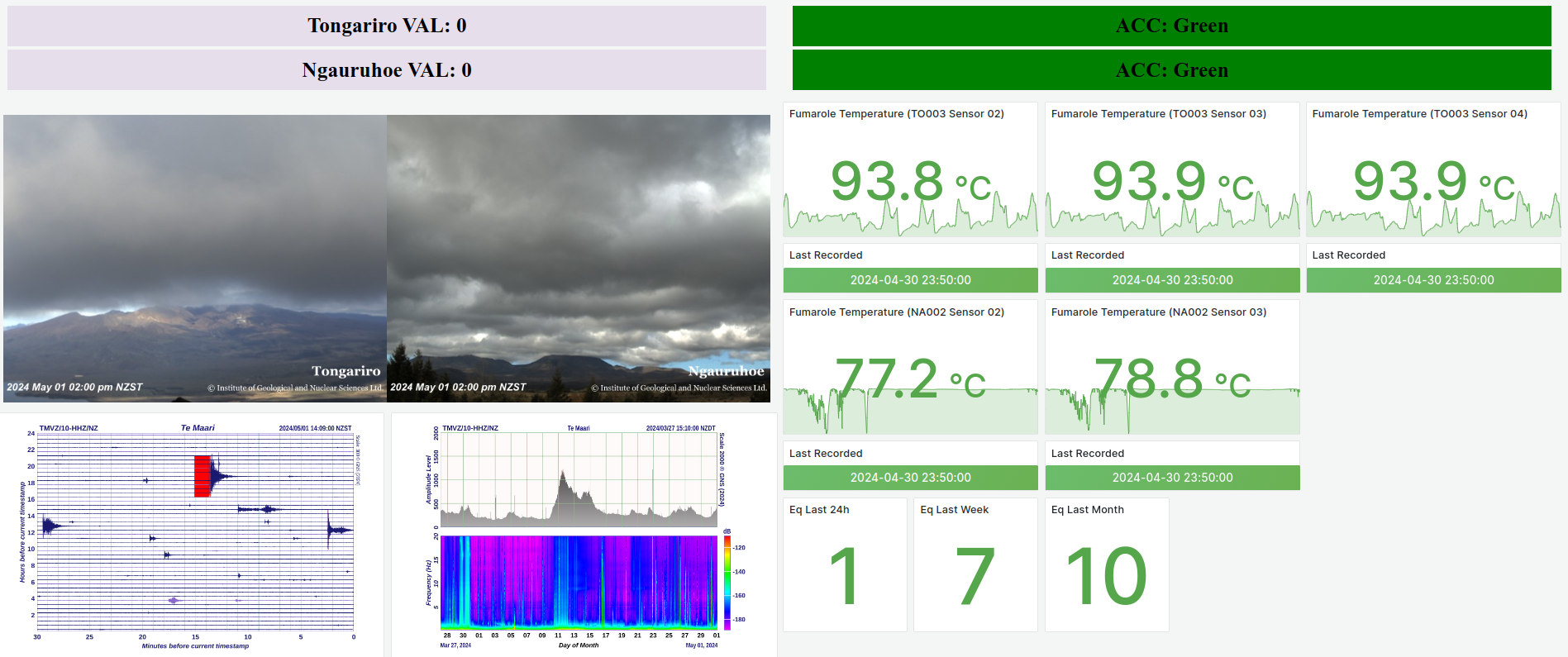
A common tool for data exploration is a “dashboard”. Think the display behind the steering wheel in a car. Instead of showing your speed and how much petrol (or battery capacity) you’ve got left, a data dashboard typically shows graphs or tables of the data you want to explore.
A good dashboard will let you interact with your data. This might mean selecting which data to graph, what time range to show, and what kind of graph – scatter plot, line plot, pie chart, etc.
Explain
While the versatility of a dashboard tool gives freedom to explore data, they don’t make the best data explanation tools. By default, graphs often don’t highlight the data you want to emphasise, and titles and axis labels are usually generic when you want something more descriptive. What usually works best is a graph or table made especially to explain your results and highlight the main point you want to get across to your audience.
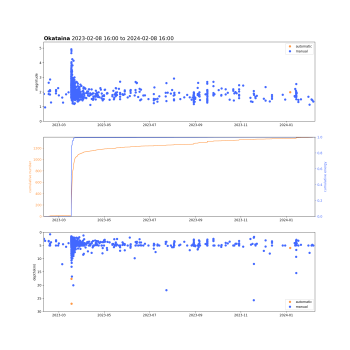
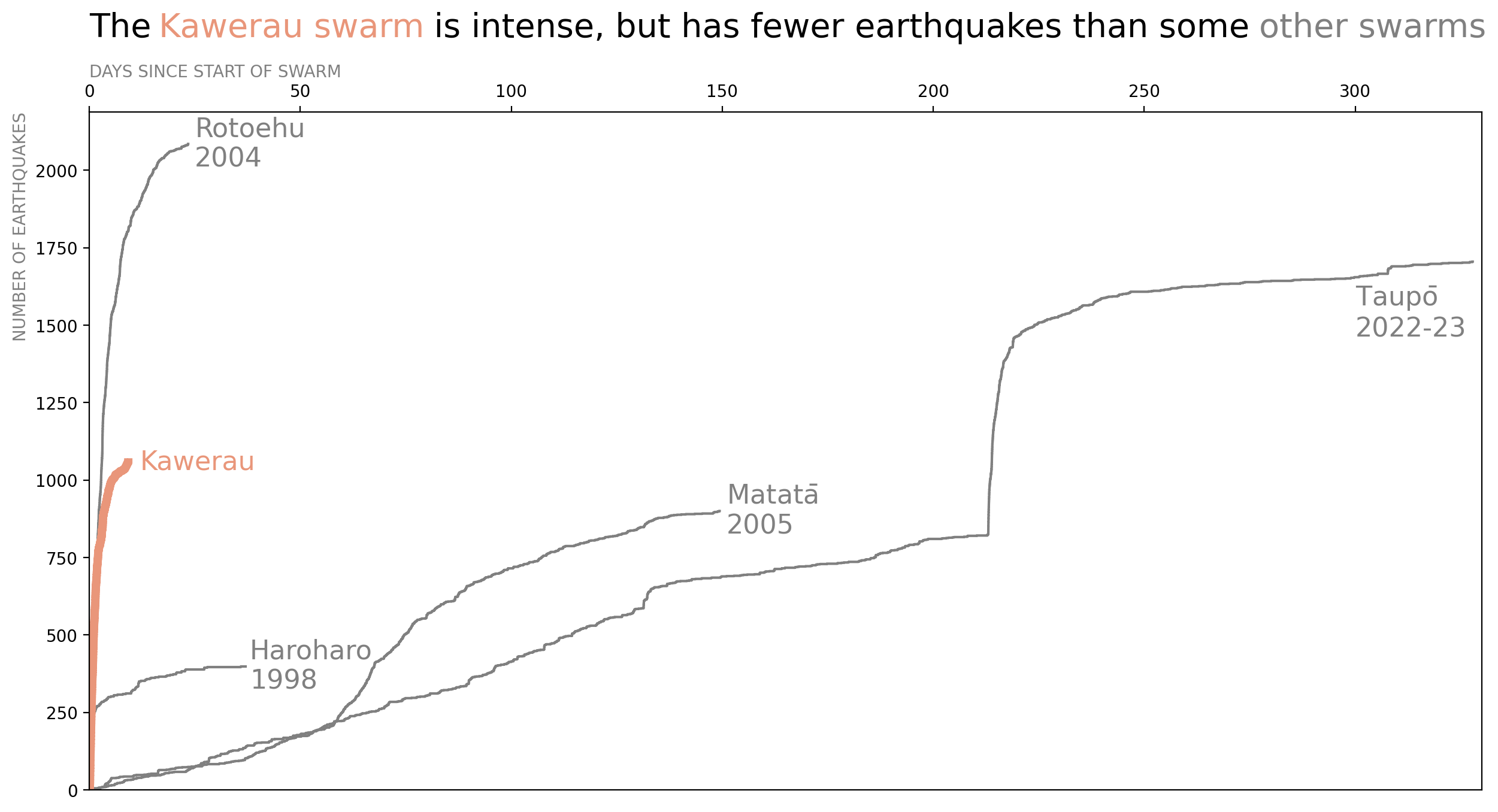
Here’s an example comparing an earthquake activity monitoring graph used for exploration with one used for explanation from a blog on an earthquake swarm at Kawerau in March 2023. The monitoring graph is used regularly by the Volcano Monitoring Group (VMG) to assess changes in the rate of earthquakes in and around the Okataina Volcanic Centre, about 30 km east of Rotorua. It shows earthquake magnitude versus time (top), the cumulative number and energy of earthquakes with time (middle), and earthquake depth versus time (bottom). The graph from the blog focuses on the cumulative number of earthquakes with time and compares that with some earlier nearby earthquake swarms.
While the monitoring-exploration graph shows the cumulative number of earthquakes with time perfectly well in its middle part, it shows lots of other information too. Information not essential to explaining how the Kawerau swarm was so active in such a short period of time. At a pinch, the monitoring-exploration graph would work for explanation if you removed the unnecessary parts and perhaps added some words highlighting details to emphasise, but the blog-explanation graph is better for this stage in the data journey.
That’s it for now
We want you to get the most out of our data, and part of that is trying to help you understand how to work with, and think about working with, the data. While you don’t have divide your data journey into Discover, Explore, and Explain steps, and you don’t have walk through every step, we think there are benefits in knowing what tools or tasks might serve you best at each stage.
You can find our earlier blog posts through the News section on our web page just select the Data Blog filter before hitting the Search button. We welcome your feedback on our data blogs and if there are any GeoNet data topics you’d like us to talk about please let us know!
Ngā mihi nui.
Contact: info@geonet.org.nz
