What is the Average?
Welcome, haere mai to another GeoNet Data Blog. Today’s blog is about averages. We look at volcanic gas emission rates and see why some average values might be better than others.
When you see a data value collected by GeoNet, particularly one we’ve collected by hand, do you every wonder what we’ve done with the data to arrive at that value? In some cases, the value represents an average of several observations, and we are going to take a close look at that averaging.
Different measures of average
At school we commonly learn that the average of a group of numbers is a single value that represents the centre of the whole group, statisticians call this a measure of central tendency. The most common measures of central tendency are the mean, the median, and the mode.
The mean is calculated by summing all the values and dividing that sum by the total number of values. When someone talks about an average, they are often talking about the mean, though they don’t always say so.
The median is the value that divides all the values into two equal halves. Another way to describe this is the middle value when all values are placed in order from low to high.
The mode is the most common value. The mode is typically only useful when values are whole numbers, that is, they don’t have decimal parts. The mode isn’t normally useful for the kind of data GeoNet collects because the data are so precise that typically every value is unique.
Mean versus median
If you are calculating just one measure of average, mean or median, which should you calculate? The answer may lie in the fact that the mean is very sensitive to extreme values (sometimes called outliers) and the median is resistant to extreme values.
Here’s an example from Alberto Cairo’s book The Truthful Art. There was a group of seven university graduates, one of whom happened to be basketball star Michael Jordan. In their first year after graduating university, what was the average salary of the group? The salaries were $20k, $22k, $25k, $30k, $32k, $40k, and $5 million (Michael Jordan’s salary). The mean salary of the group was $738k and the median was $30k. In this case, there is an extreme value (Michael Jordan’s salary), and the median value is a better estimate of the salary of the group as a whole.
This example provides another way of thinking of mean and median. The mean is average salary, and the median is the salary of the average person.
Before we finally jump to a GeoNet example, one last comment: if the mean and median aren’t similar, then this suggests the data might have low value or high value outliers. In the Michael Jordan example, he is a high value outlier.
A GeoNet example - volcanic gas emission rates
Let’s look at a GeoNet data example. One of several techniques the Volcano Monitoring Group (VMG) uses to measure gas emission rates (sometimes called gas fluxes) are ‘gas flights’, where instruments are installed in a plane that flies near a volcano measuring gas concentrations. You can find out more about exactly how the data are collected on our How we monitor volcanoes web page.
One of the methods used to measure gas concentrations involves flying beneath the volcanic gas plume several times, usually seven or eight passes if weather and plume conditions allow. The concentration from each pass is converted to an emission rate using a wind speed that is also measured during the gas flight. The adopted value is the mean emission rate of all passes beneath the plume. That emission rate is what we make available through the Tilde Data Discovery GUI and what the VMG uses in its assessment of volcanic activity. The units of emission rate are kilograms per second (kg/s) or tonnes per day (t/d), which volcanolgists sometimes favour.
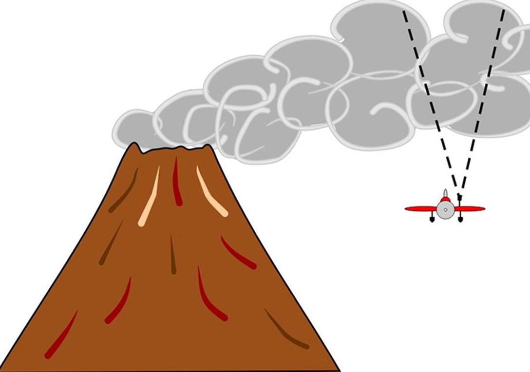
How gas concentration measurements are collected. A plane containing measurement equipment flies under the plume several times and measures a concentration. Each concentration is converted to an emission rate, and we calculate the mean emission rate.
The emission rate average
By now you might be wondering why calculating an average is so important to a gas flight and why this deserves a data blog. To explain this, we need to talk about a gas flight at Whakaari/White Island on 27 May 2024, and specifically the sulphur dioxide (SO₂) emissions measured by an instrument called a “Flyspec”.
That flight passed beneath the gas plume seven times. Rather than the plume being continuous and having about the same amount of SO₂ everywhere, it was what our VMG experts call “puffy”. Yes, we know that’s not a very technical term but that’s what they use! Puffy means that the plume doesn’t come out of the volcano’s vent continuously but in puffs, perhaps a few 10s of seconds or a few minutes apart. This means that when the plane passes beneath the plume after it has been blown by the wind a few kilometres from the volcano, it sometimes measures a puff with lots of SO₂ and sometimes a part of the plume that has little SO₂.

Whakaari/White Island emitting a “puffy” gas and steam plume on 26 February 2013
In the case of the 27 May 2024 observations, one SO₂ value was quite a lot higher than the others. The mean emission rate, which is what the VMG calculates and we provide through Tilde, was 8.6 kg/s (kilograms per second), while the median was just 5.8 kg/s.
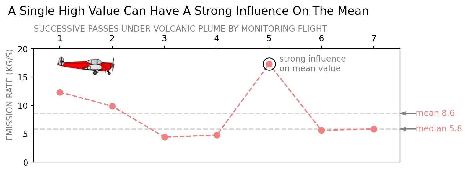
Estimates of SO₂ gas emission rates from Whakaari/White Island on 27 May 2024 made from seven successive passes beneath the volcanic plume.
The VMG uses the standard error of the emission rate for all passes as the error on the mean of the observations, but it is better thought of as an estimate of consistency of the emission rates from each pass. The standard error is provided in Tilde as an “error bar” on the emission rate value. For the 27 May 2024 observations, the standard error was 1.8 kg/s, which is quite a bit larger than the standard error for other observations in the first part of 2024. This shows there was a relatively large spread in emission rates from the plume on 27 May 2024, in other words, a puffy plume.
When the SO2 emission rate from the 27 May 2024 observations was calculated, Whakaari/White Island had recently experienced a second small eruption, so the emission rate was an important part of the VMG’s assessment of the activity. If the VMG had used the median emission rate rather than the mean the value would have been lower. But it would still have been the highest for several years, so is unlikely to have changed the VMG’s assessment.
A quick note for anyone interested in getting the data we’ve talked about from our Tilde application. The observations were made on the morning of 27 May 2024, which is 26 May 2024 Universal Time (UTC). All the data in Tilde use UTC as their time base, so the 27 May 2024 observations are listed as 26 May 2024.You can read more on why we use UTC in a previous blog here.
Mean and median in Tilde
This is a good opportunity to highlight that you can access the mean and median of some data sets through GeoNet’s Tilde Data Discovery GUI. The GUI (Graphical User Interface) provides the option of combining data collected frequently over a longer time period and calculating the mean or median (and some other functions of the data). In the example below, we show the carbon dioxide gas (CO₂) concentration measured in the air at one of our sensors near the summit of Ngauruhoe volcano. The data are collected every 10 minutes and what we’ve done is taken all the data for July 2024 and calculated the mean value for each day in the month.
The key part of the GUI that does this is the section labeled “Aggregation”. The maximum “Aggregation Period” is one day (1d) and the “Aggregation Function” offers the minimum (min), maximum (max), mean, total (sum) and percentile (perc(N)). The perc(N) option can be used to calculate the median if you specify a percentile of 50. You’ll recall from earlier that the median splits data ordered from low to high into two groups of equal size. The median is 50% of the way through the data. We talked about percentiles in a data distribution in an earlier blog.
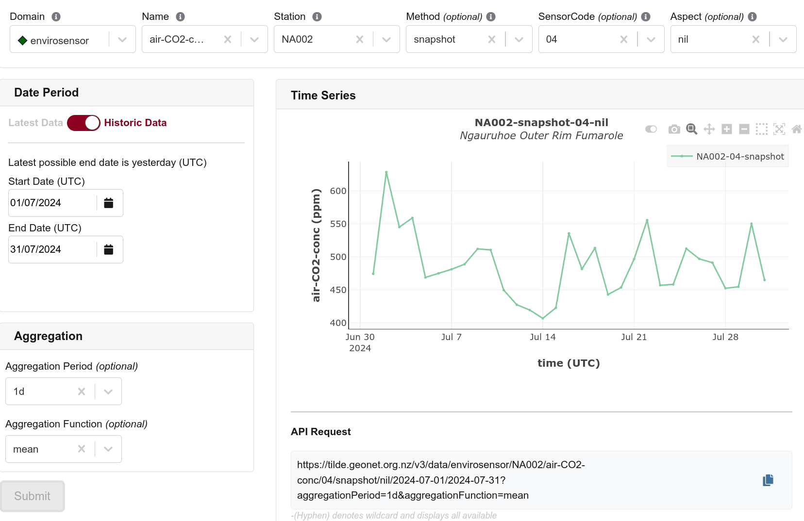
How to use our Tilde Data Discovery GUI to calculate the mean value of a data set for each day. The daily period and mean are set in the Aggregation section in the lower left.
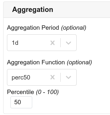
If you want to calculate the daily median value in the Tilde Data Discovery GUI you need to set Aggregation Function to perc(N) and Percentile to 50. When you do that, perc(N) changes to perc50.
If you want the mean or median of a whole data set, you can do that with Tilde too! We’ve got a series of data tutorials in Python and one of those shows how to find the mean and median for a long period of data from Tilde.
That’s it for now
Next time you read or hear something that says “the average was xxxx”, stop and think about it. Are they using the mean or median, and will it make a difference to what they are saying? As you’ve seen that simple choice can influence the data GeoNet provides, so it deserves some thought.
You can find our earlier blog posts through the News section on our web page just select the Data Blog filter before hitting the Search button. We welcome your feedback on our data blogs and if there are any GeoNet data topics you’d like us to talk about please let us know!
Ngā mihi nui.
Contact: info@geonet.org.nz